Traffic from mobile devices has been consistently growing over the last few years. It’s a big reason why you should get a mobile solution for your website in place, but now there’s an even bigger reason to have a mobile-friendly site.
On April 21, Google started using mobile-friendliness as a factor when determining rankings for mobile search results. This means that if someone is searching from their smartphone and your website is not mobile-friendly, your website will be less likely to appear in the search results.
In Google’s own words, this update “will have a significant impact in our search results”. That’s public-relations-speak for “If you don’t have a mobile-friendly website, you won’t be performing well in mobile search results.”
If you’re not sure if your site is mobile-friendly, Google has a handy tool for you to find out.
So what are your options when it comes to mobile solutions for your website?
Mobile Website Options
Small businesses really have three options for making their websites accessible to mobile users: 1) do nothing, 2) build a dedicated mobile site or 3) add responsive design elements to their existing site.
Do nothing
In many cases, mobile browsing applications are able to make non-mobile-friendly websites at least functional when viewed on a mobile device. You’ll be giving your smartphone and tablet visitors a less optimized experience but they’ll still be able to browse around your site.
However, the impending update to Google’s algorithm means that choosing this option will make your website less likely to appear in mobile search results. That will ultimately result in less traffic and less leads.
Mobile dedicated
When browsing on your phone or tablet, you might notice that you are sometimes redirected to a URL like m.example.com. This means that the website owner has created an entirely separate website specifically for mobile users.
This is a perfectly acceptable way to build a mobile-friendly website, but it does come with some pros and cons.
The advantage here is that you can make the experience for mobile visitors much more friendly. Larger buttons and drop down menus make it easier to navigate, and you can decide where and how important content, like your contact information, is displayed so that mobile users will be able to find it quickly.
The downside is that you have to maintain a second website alongside your main website. This essentially doubles the amount of work to make updates. You’re also forced to choose to optimize for either smartphone users or tablet users, but not both.
If you’re not careful, it’s very easy to make mistakes that can negatively impact your site’s performance in search results. Incorrectly mapped redirects and broken pages are common on mobile dedicated sites which Google is not fond of.
Responsive design
By using some fancy HTML and CSS, responsive design automatically changes the layout of your website based on the screen size of the visitor. This means you can have optimized user experiences across desktops, tablets and smartphones. No one gets left out!
Learning to build a responsive site takes a bit of skill, but it resolves the issues that you would normally encounter with mobile dedicated sites – there’s only one version of the site to maintain and there aren’t any funky redirects to screw up.
If designed correctly, responsive websites can be powerful and flexible. As with dedicated mobile sites, you can display information specifically for mobile users like a map or phone number.
Sounds pretty great, right? Well, I haven’t even gotten to the best part yet – we’ve already done all the work for you!
Say hello to our mobile-friendly platform, Phoenix
Phoenix is our upgraded WordPress platform that is fast, powerful, flexible and responsive! Take a minute to check out our showcase to see some of the beautiful and mobile-friendly websites our team has been building.
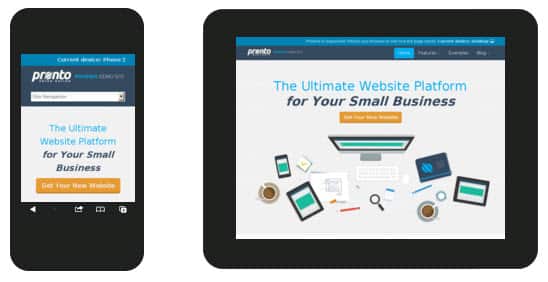
Through Phoenix, we’re able to build gorgeous websites that tell the unique story of your business. And in case you were wondering, here’s an example of how it adjusts based on screen size.

It’s time to bring your website up to modern standards and make sure you don’t get left behind in the search results. Learn how we can help.


