Improving Your Website’s User Experience

Now that you’re generating some good traffic by getting found online, your next focus is getting that traffic to stay on your website.
It depends on the industry, but most websites have a 30-60% bounce rate on average.
This means a large majority of web traffic entering your website leaves without navigating to any other pages. And many times, they may never come back. Yikes!
Here are some tips you need to consider to improve user experience and decrease your bounce rate.
The First Impression
Your website represents who you are and what you offer. When people see it for the first time, they’re thinking:
- Is this site credible?
- Is it trustworthy?
- Is this a professional company?
- Is this company stable?
- Does this site make me feel welcome?
- Am I in the right place?
You need to ask yourself all of these questions when designing your website.
Now, design may not be the most important factor in a website overall, and oftentimes folks put too much emphasis on how a site looks instead of how it works, but it does play an important role in making a good first impression.
Tips for a great website design:
Use the right colors for your audience and draw attention to select elements. Don’t try to make everything jump out. The result will be just the opposite – nothing will stand out.
Avoid a chaotic mix of colors on your website and instead, pick two to four colors for your template and marketing materials.
Avoid anything unnecessary. Using Flash animations because they look cool is the wrong strategy.
In most cases, it’s best not to use animated background or background music. Only use media and animations to help support content and information.
Create a clear navigation structure and organize page elements in a grid fashion (as opposed to randomly scattered).
Also, don’t be afraid of white space and avoid clutter!
Make sure your website is legible. Use fonts, font sizes, and font colors that are easy to read.
For easier page scanning, use bullet lists, section headers, and short paragraphs. If your site is English language-based, make sure information flows from left to right and top to bottom.
Maintain Consistency
It’s best to keep elements on your site fairly consistent from page to page. Elements include colors, sizes, layout, and placement of those elements.
Your site needs to have a good flow from page to page. This means colors are primarily the same as well as fonts and layout structure.
Navigation should remain in the same location as your layout throughout your website.
For layout structure, typically, three-page layouts exist for most websites: one for the homepage, one for content pages, and one for form pages.
For example, your homepage will have a different layout than a landing page for a PPC campaign. Keep the elements in these layouts constant. This will help keep your visitors from feeling lost.
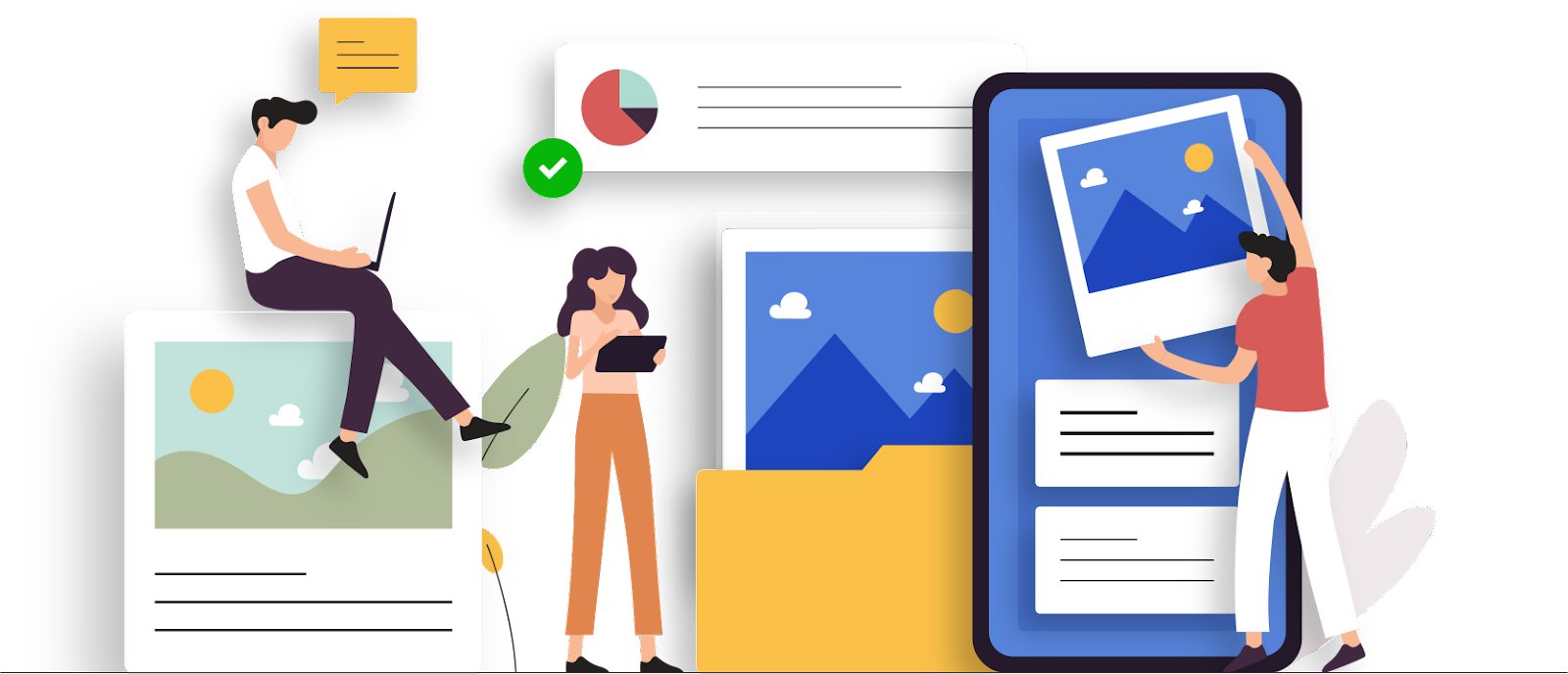
Using the Right Images
Images can be a powerful element to any website, but you need to use them wisely.
For example, consider stock photography. Stock images are seen everywhere because they are easily accessible and inexpensive. But are they good to use?
Marketing Experiments performed a test comparing the use of stock photography versus real imagery on a website and each of their effects on lead generation.
They found that photos of real people out-performed the stock photos by 95%. Why? Because stock images tend to be irrelevant. Resist the temptation to use photos of fake smiling business people!
As a result, take care to place meaningful images on your site. Every image transmits a subconscious message to your audience, and sometimes the result is different from what might be expected.
Navigation
Perhaps one of the biggest factors to keep visitors on your website is having a good, solid navigation system that supports all search preferences.
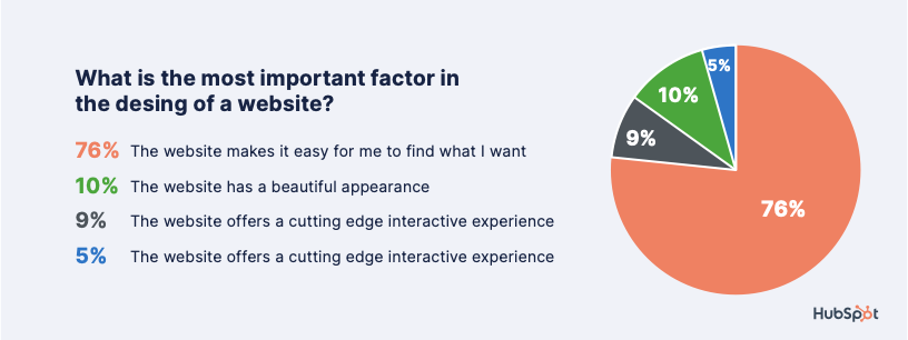
More than three-quarters of survey respondents from a HubSpot study say that the most important element in website design is the ease of finding information.
If people can’t find what they are looking for, they will give up and leave.
Important factors in a site’s navigation include:
Keep the structure of your primary navigation simple and near the top of your page.
Don’t dig too deep – in most cases, it’s best to keep your navigation to no more than three levels deep.
Include navigation in the footer of your site.
Include a Search box near the top of your site (or blog) so visitors can search by keywords.
Don’t offer too many navigation options on a page.
Include links within your page copy and make it clear where those links go to. This is also great for SEO!
The overall rule with a proper navigation structure is simple: don’t require visitors to have to think about where they need to go and how to get there. Make it easy for them.
Accessibility
Make sure that anyone visiting your website can view it no matter what browser or application they are using.
To gain significant traffic, your site needs to be compatible with multiple browsers and devices.
With the growth in mobile phones and tablet devices, people are surfing the internet more than ever before.
Make sure to get some of those views by allowing everyone to view your site, no matter what kind of system they run or which browser they use.

For more hands-on help from the Pronto team, book a free meeting with a Pronto advisor.
©2022 Pronto Marketing All Rights Reserved.