Recently Google+ made headlines by introducing a new profile layout. In case you don’t use your Google+ account, or don’t keep track of all the hot things coming out in the big digital world, here’s a quick recap of what the folks in Google have changed for us. The good news is, we have found this change to be beneficial, especially if you use a Google+ page for your business.
Bigger…no, HUGE cover photo
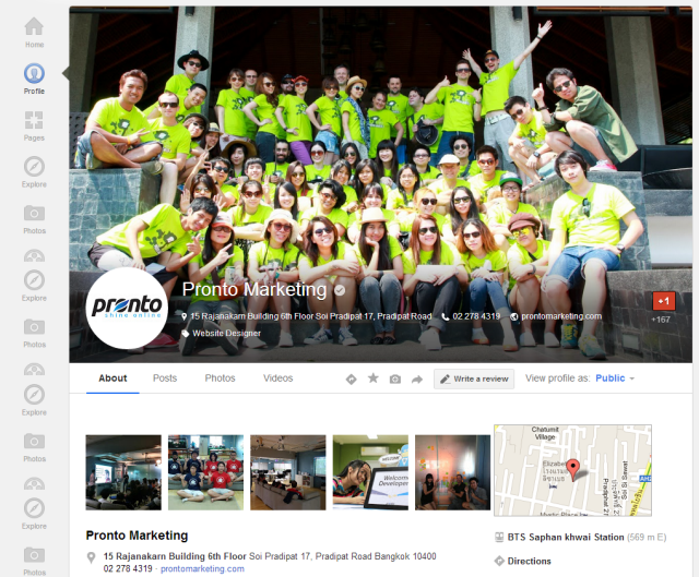
As opposed to previously having two options for profile covers – filmstrip or a banner cover photo – Google has moved all users to a large cover photo: 2,120 pixels x 1,192 pixels (16:9 ratio). It is responsively designed, which means, the size of your cover photo will be automatically resized to the viewer’s browser window.
Your personal information has also been moved, it can now be found at the bottom of the cover image. The big change is that your profile name and picture now stick to the top of the page and are visible when a user scrolls down. This is something to keep in mind while designing your new cover image.
Circular profile Image
Your profile image and information no longer hovers below the cover image, it now hovers at the bottom left of the cover image. The image itself has also changed: It’s now circular, with 270px diameter, and been shrunk down to around 104px.
While the circular image looks great, it may take some customization if you use this space for your logo, and it isn’t round. Some users have been commenting on this profile image not being prominent enough on the huge cover pic, however, there’s plenty of space to be creative and make sure one compliments the other.
The final cosmetic change revolves around the +1 button, which can now be found at the lower right corner of your cover image.
Good or bad?
The general consensus at the office is that this new layout looks great. It gives plenty of space for you to get creative, making your options nearly limitless, which is especially important for businesses. To some this will be the perfect full-screen advertising space, promotion board or whatever your creative heart desires.
The huge image has drawn comparisons to Facebook’s cover photo (and rants from those who don’t like it). It seems to us, however, that Facebook Page owners should thank Google+ for this change, and the bigger opportunities they now have on Facebook.
Shortly after the launch of the new Google+ layout, Facebook eased it’s cover image restrictions. Now, text shouldn’t take up more than 20% of the cover photo. Compare this to last year’s revision which stated that a Page’s cover photos could not display any text including calls to action, asking for likes, URLs, prices or offers.
Google+ doesn’t have any of those limitations, so go ahead and put some text in your cover image, just be sure that it’s not all text. As they say, competition makes the world go round.
Conclusions
From what we can see, feedback on the change has been positive, for the most part. Once again, if you didn’t like the Facebook cover photo when it was introduced, preferring your content to be more prominent than your cover photo, you may find the new Google+ layout a bit much. However, business wise, we find that it has higher potential to make you and your business stand out.
We think Google could have done a better job on rolling out the change. It was announced via some employees’ Google+ pages and then the move just happened. As a result, many users found out about the change by seeing their newly messed up profiles.
This was even a bigger deal for those users who preferred the filmstrip of their carefully chosen photos over the banner option. Not a good surprise, is it? Moreover, there was no choice between the ‘old’ and ‘new’ layouts given for the interim period (like what Facebook did with Timeline). People do not like to be forced into anything, and this is where most of the negative feedback about the new layout has originated from.
All in all, we love the new Google+ evolution, but there is still more changes to cover including the introduction of the Local Reviews section and more detailed info fields. We’ll talk about these changes soon, but for now it’s time to check out your new Google+ profile layout and get a little creative.
Written by
Tim Kelsey
As the Managing Director at Pronto Marketing, Tim leads our team in delivering high-quality digital marketing and white label services to our clients. With his extensive experience in the industry, Tim provides strategic guidance and oversight to ensure our clients receive the best possible results from their dollars spent.