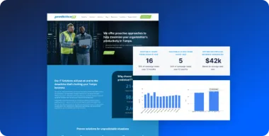


Over the past few years, the mobile market has increased by leaps and bounds, and next year, the total number of mobile searches will surpass desktop searches for the first time. You can’t afford to ignore mobile anymore. Having just a standard website isn’t enough. It now needs to be mobile-friendly – ready to direct smartphone and tablet visitors to the appropriate information quickly and easily.

And it’s not just visitors from search that you need to worry about. Today, mobile traffic comes from all traffic sources especially email and social media. Who doesn’t check email on their phone first thing in the morning or spend the evening browsing through articles shared on Facebook?
When we look at mobile traffic across all Pronto websites, we see the same strong and consistent growth.
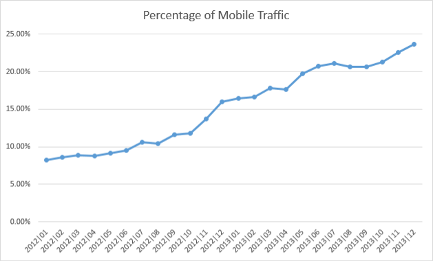
At the end of 2013, our websites saw almost 24% of their traffic coming from smartphones and tablets. That’s more than enough traffic for you to be considering how your website looks to mobile visitors.
Mobile Website Options
Small businesses really have three options for making their websites accessible to mobile users: 1) do nothing, 2) build a dedicated mobile site or 3) add responsive design elements to their existing site.
Do nothing
Web browsers are pretty incredible. Almost every site on the internet has at least a few errors in its code, but browsers are smart enough to fix these on their own and display a functioning page. They also do a decent job of working with non-mobile optimized sites from a smartphone or tablet.
If you haven’t done any mobile optimization on your site, chances are it will still display correctly. However, the experience for the mobile user will be pretty poor. Content and links will be very small making it difficult for mobile visitors to navigate to the information they’re looking for. This often results in mobile users quickly leaving your site in search of a better user experience.
Mobile dedicated
When browsing on your phone or tablet, you might notice that you are sometimes redirected to a URL like m.example.com. This means that the website owner has created an entirely separate website specifically for mobile users.
The advantage here is that you can make the experience for mobile visitors much more friendly. Larger buttons and drop down menus make it easier to navigate, and you can decide where and how important content, like your contact information, is displayed so that mobile users will be able to find it quickly.
The downside is that you have to maintain a second website alongside your main website. This essentially doubles the amount of work to make updates. You’re also forced to choose to optimize for either smartphone users or tablet users, but not both.
If you’re not careful, it’s very easy to make mistakes that can negatively impact your site’s performance in search results. Incorrectly mapped redirects and broken pages are common on mobile dedicated sites which Google is not fond of.
Responsive design
By using some fancy HTML and CSS, responsive design automatically changes the layout of your website based on the screen size of the visitor. This means you can have optimized user experiences across desktops, tablets and smartphones. No one gets left out!
Learning to build a responsive site takes a bit of skill, but it resolves the issues that you would normally encounter with mobile dedicated sites – there’s only one version of the site to maintain and there aren’t any funky redirects to screw up.
If designed correctly, responsive websites can be powerful and flexible. As with dedicated mobile sites, you can display information specifically for mobile users like a map or phone number.
Sounds pretty great, right? Well, I haven’t even gotten to the best part yet – we’ve already done all the work for you!
Say hello to our new mobile-friendly platform
We’ve been hard at work developing a brand new WordPress platform for us to build websites with. We call it Phoenix and it’s fast, powerful, flexible and responsive! Take a minute to check out our Phoenix Demo Site to see it in action and browse through a couple of sites that we’ve created for our clients.
Go ahead…I’ll just wait for you here.
I know, it’s really cool. We’re super proud of our development team for all the hard work they put into building this platform.
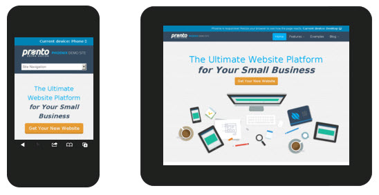
Through Phoenix, we’re able to build gorgeous websites that tell the unique story of your business. And in case you were wondering, here’s an example of how it adjusts based on screen size.
Mobile Performance on Phoenix
Building beautiful websites is great and all, but we didn’t want to just stop there. We wanted to make sure that Phoenix is able to provide a great user experience for your visitors – which ultimately leads to more conversions for you.
Below is some data comparing mobile traffic to Pronto websites on Phoenix against Pronto websites on our old platform.
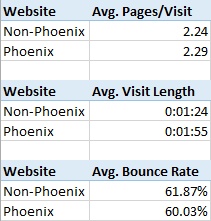
At first glance, it might not seem like much is going on here. Mobile visitors to Phoenix sites tend to view slightly more pages and bounce slightly less often, but what is surprising is that, on average, they spend 31 additional seconds on Phoenix sites. That’s an eternity in internet time and it means that they are actually taking the time to read content and interact with the site.
It’s time to bring your website up to modern standards. Stop letting your mobile visitors languish in the realm of the unoptimized page. Give them the user experience they want and deserve.